Aug 30
Hi there! I’m bringing you the first post for today - Waltzingmouse Pajama Party launches also in a couple of hours! I could wait until I have a day free of posting to share this… but then again, I couldn’t. LOL! I’m getting very enthusiastic at times, I’m sure you’ve noticed. D’oh!
It’s been a log time since I shared a Design Infused project. A reminder for those who don’t know what the deal is.
My aim is to take a design piece that inspires me (be it a stationery, clothing, packaging, etc.), and translate it into a graphic and simple design, using mainly stamps. I take great joy in letting what I see around the internet, influence my designs, and I’m on a mission to show you how easy it is once you let your imagination flow. I collect the inspiration in a Pinterest board especially created for this purpose, and I pick a piece from the lot for each installment of this feature.
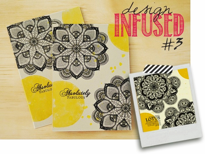
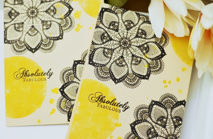
Today’s project evolves around this amazing poster below. It got a fair number of repins so I assumed that you’d be happy for me to feature it. Why, yes I’d love to! Jaw-dropping, fantastic, solid piece of art. And so easy to be made into a stamped project!
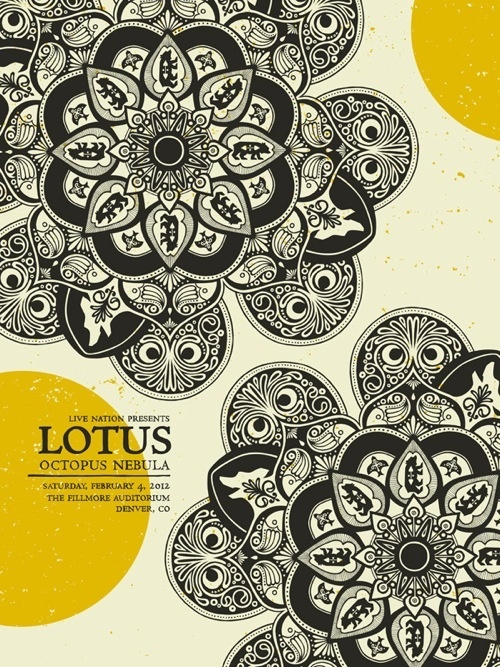
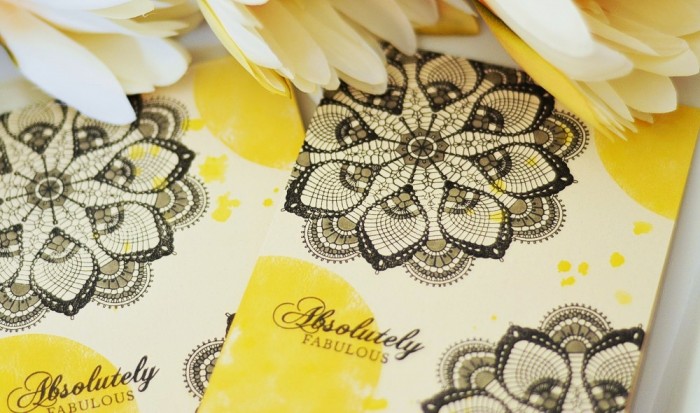
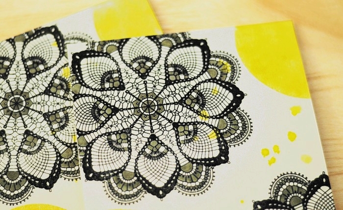
First up, the mandalas. Easy enough to recreate with one of the doily stamps available on the market. I have a soft spot on doilies so I spent a fair while trying to choose one from the variety I’ve got 🙂 I settled down on the Filigree stamp set from Mama Elephant, for the similar shape. It’s a dainty little thing so I added some more body to it, by filling in some space with a grey Copic marker.
The mustard spots were created by inking the back of a clear circle stamp. Any stamp will do, as soon as the shape of the piece of photopolymer is an ideal circle. The effect achieved by stamping it this way is uneven, and this is exactly what I was aiming for. Lastly, I flicked some spray mist over the entire thing. Notice how I carried the imperfections and speckles through to my cards?
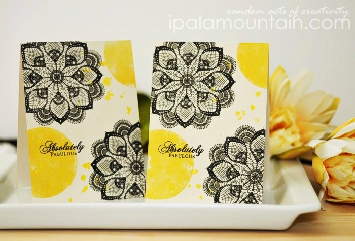
Here’s a close-up of the Copic work. I like how it makes the doilies stand out.
I hope you enjoyed my Design Infused project! See you again soon enough, for a fun, nautical Father’s Day card!


WoW!!! ABsolutely stunning. I’m a sucker for doilie (s?) designs. :), vanessa
I just FELL off my chair. I need to do this as well! If you EVER do a design infused as a monthly feature or any feature and add others to join, I am IN. (!!) I may have to just add this to my blog.
This Rockets to the MOON!
Fantastic 🙂
Wow, I love this. Great interpretation of the poster. The copics really did bring out the doily. Just fabulous. Thanks so much.
Es fabuloso el resultado. Personas con tu sensibilidad y creatividad son un ejemplo para los que comenzamos en trabajar entre papel. Que pases un feliz dia
wow! gorgeous!
Delicious!
Great work!
Wow! I love the effect of using grey in the doily! Beautiful, beautiful design!
This card is stunning! Love your inspiration!
I absolutely adore your copic coloring in the doily! It looks fantastic, and I daresay I love your cards better than the original pin.
grrr. the shady hospital wifi ate my first comment. but i love this project so much that I’m gonna try again. The grey coloring in the doily is fantastic! I can’t get over how much that adds to the original image. I love your interpretation better than the original print!
I know how popular this post has been already, so all I can add is this is signature you - I love how you interpreted the original but yours is a hundred times more awesome anyway. 🙂 The grey shading with the Copic really adds so much!