Jun 03
Hey, I’m blogging for two days in a row! Not really a strange thing for me to do but I wasn’t planning on it until late afternoon, when mojo hit me and I had to aid it ‘here and now’. Then I thought, oh well, why not share it while I’m at it so here I am 🙂
I’ve been hugely inspired by Dawn’s watercolouring work with her WPlus9 stamps, love the incredible masterpieces she makes. It wasn’t until today when I read on her Instagram that she used Distress Inks to create a faux watercolour look on one of her designs, and it clicked. Disclaimer: I did know about watercolouring with Distress Inks before but I’m being silly and keep forgetting. Also, I shamefully admit that I haven’t seen any of her videos, otherwise it would have certainly clicked earlier for me… lol. If you’ve been around me in social media before, you know that I’m a notorious, stinky video tutorial avoider. Ain’t nobody have time for that in this house 😛
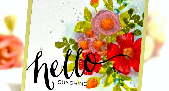
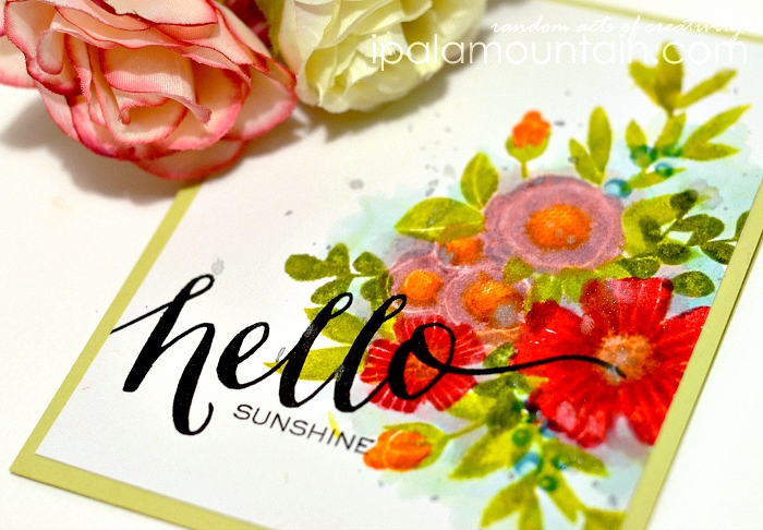
So, Dawn used a damp brush over the stamped images to soften the look, while I did it the classic way, by applying Distress Ink to the stamp and misting it lightly before stamping on paper. I clustered the elements from WPlus9 Spring Blooms without masking, I only inked the stamps selectively when needed, to avoid too much overlapping.
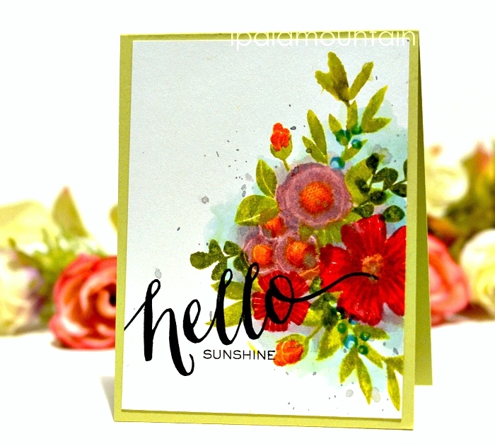
After I stamped the whole grouping, I used a clear acrylic block to pick up some ink from the inkpads and went over certain areas with a water brush dipped in the pooled ink to add depth, fill the gaps and create the background. Finally, I stamped the sentiment from Hand Lettered Hello in black ink and flicked some Silver Glimmer Mist over the whole panel.
I’m waiting for the new WPlus9 inks from the South Beach collection (see the announcement here) to arrive, and I will be back - hopefully soon enough - with some inspiration featuring those babies 🙂
Also, in the meantime I’d be thrilled if you checked out my entry for the Gallery Idol (see the widget and link in the sidebar) and considered helping me advancing to the next round, if you have a vote to spare! Thanks 🙂


Oh, it looks beautiful! Kudos to you for making such beautiful card, amidst your busy schedule! Keep it up, wanna see more! 🙂
Wow, this is stunning, Chupa! I love it!
Oh, and I can totally relate about the avoidance of watching videos….
Oh my goodness!! The depth in this water color painting is incredible!! It look three dimensional, like I could reach in and pick the flowers! You are awesome!
The dimension on the orange centers is breathtaking! BRAVO!!
Gasp!! You avoid videos??
And it cut off my comment! LOL Simply amazing work Chupa! Amazing!
Chupa this is o gorgeous! Stunning, great watercoluring!
Wow, wow and wow! This is simply amazing!
This is just gorgeous! You are very talented!!!
gorgeous!
Wow ..Gorgeous card ! I loved the coloring..gives very nice dimension to the blooms !
Love this card, Chupa! I really loved to read that you didn’t do any masking 🙂 . I’m inspired to try this too! I took a peek at the new Wplus9 colors and Might need to add those to my (ever growing) collection! And like you, I can’t sit through videos.
This card is so amazing. I wish I would’ve made it. Brilliant work girl! I just love the colors and depth and how that bold sentiment pops against it all.
This is stunning! The colors are so bright and vibrant!
Pingback: case study blog hop
I love the lime green! I never use this color- no specific reason why- however everytime I see it I think. Why don’t I ever use lime green. It’s so pretty.