Sep 30

Sketchbook Saturday Challenge #79

I’m LATE! Again!! Am I kicking off another bad habit here…? Hopefully not! I know I keep saying that, but I’ve been pretty wrapped up lately. Several things have also been happening, that are affecting my ‘performance’ (lol) but I can’t spill the beans just yet… sigh.
But! Enough blabber, you’re far more interested in that little thing below, I reckon… 😉

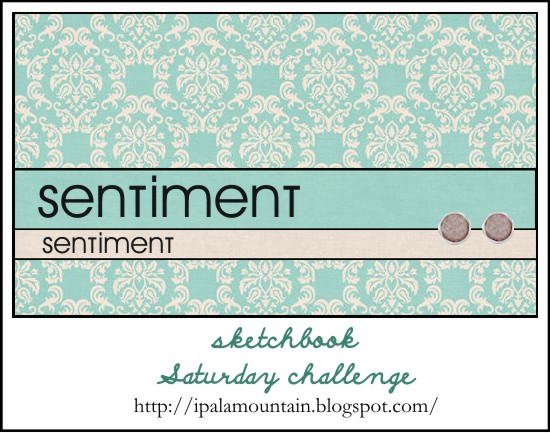
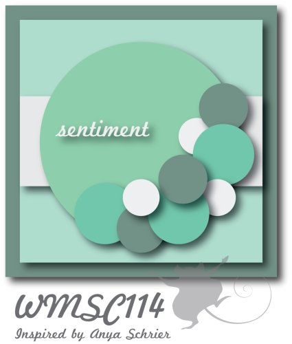
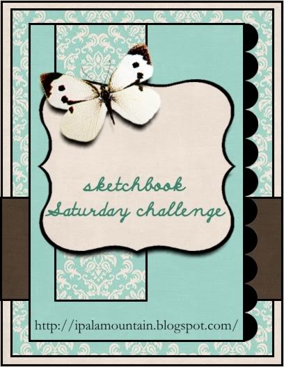
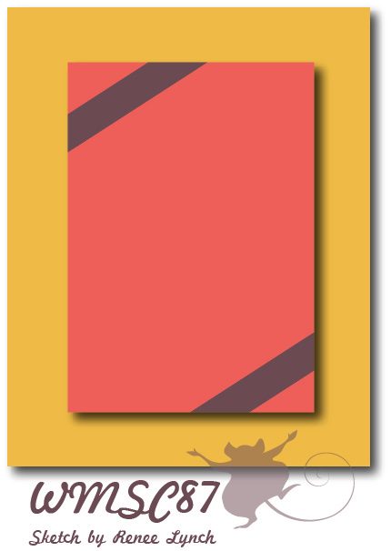
Last week I served you a square card, this time I’m asking for a long format. Pretty simple layout, with an emphasis on pretty background and a sentiment separated in two.Of course, if you wish to use standard shape, feel free! It’s a ‘free for all’ fun :)

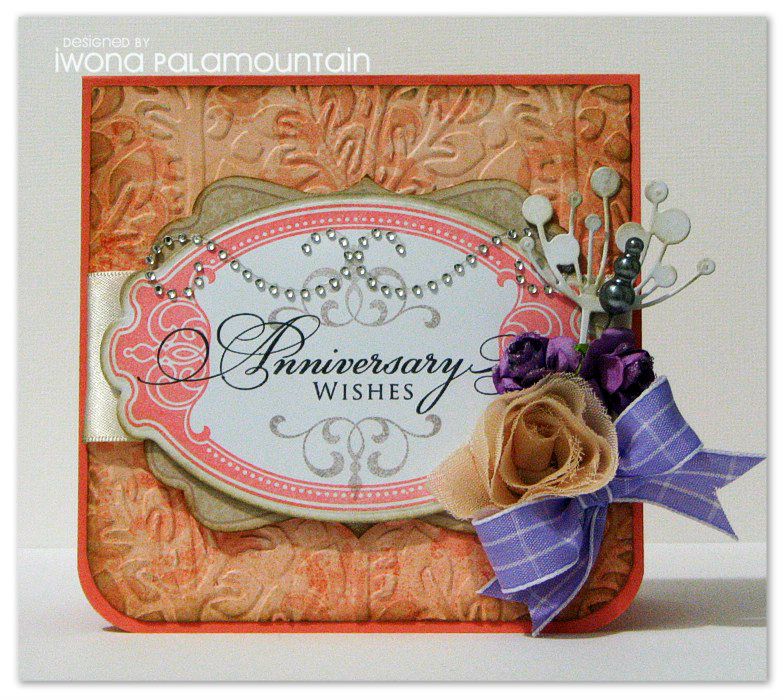
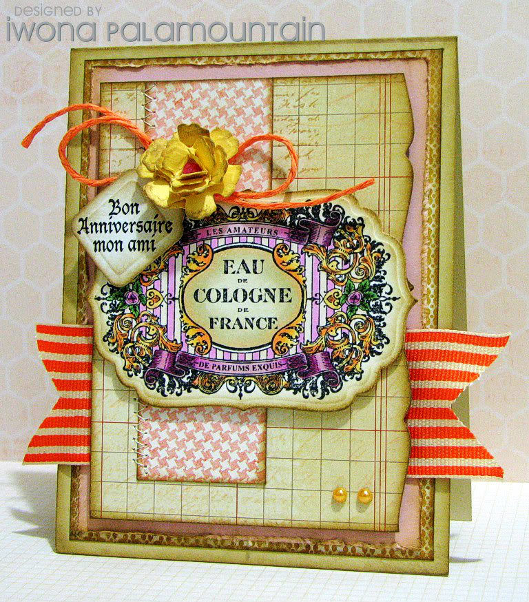
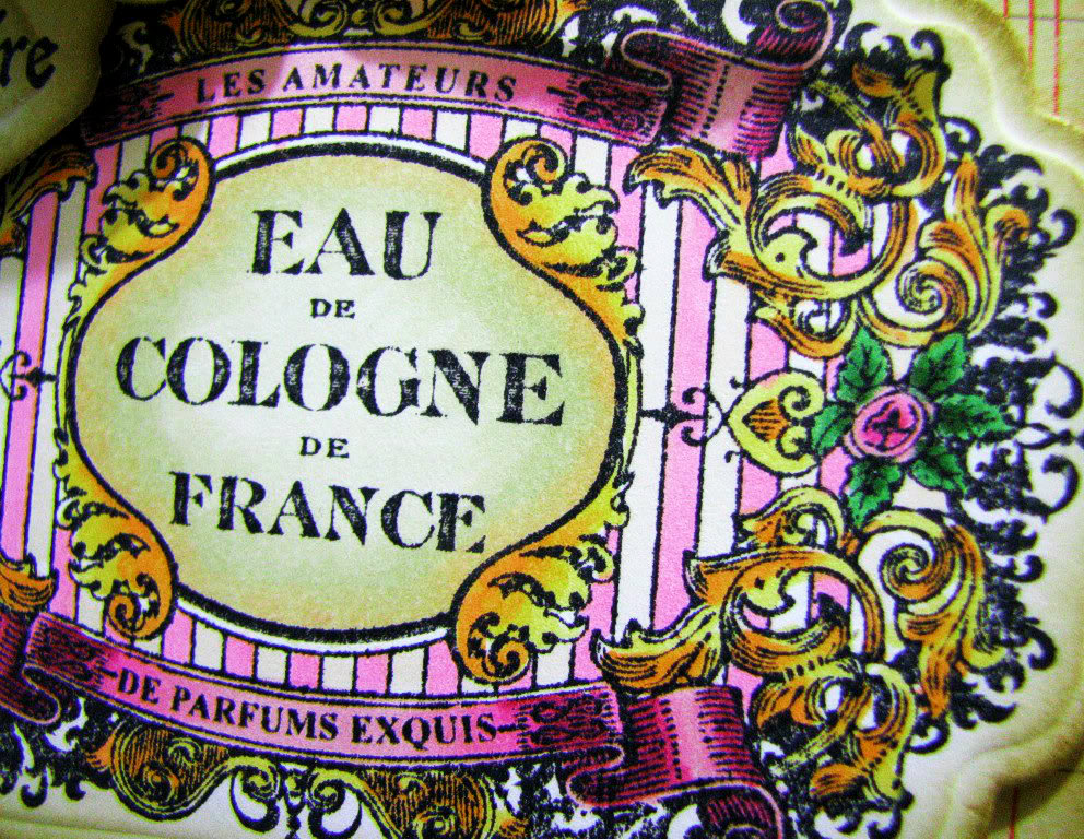
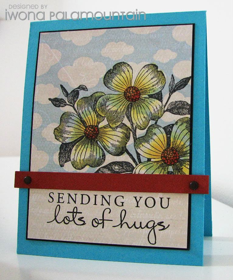
I had SO much fun making this card… I should start by saying that the idea behind it, started with the CFC72 challenge, “Toot Your Own Horn”.
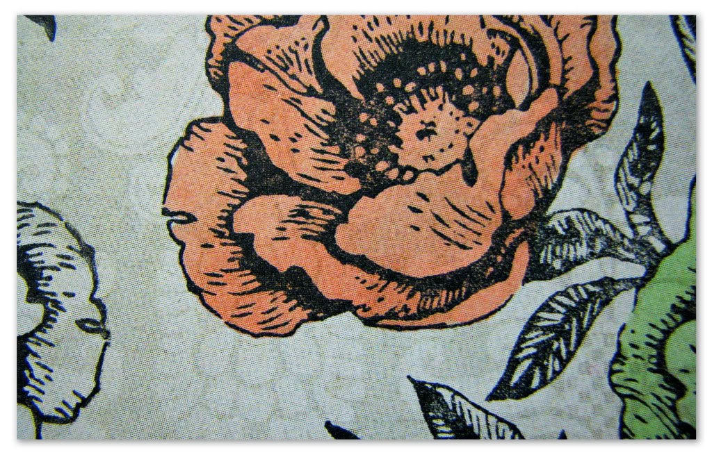
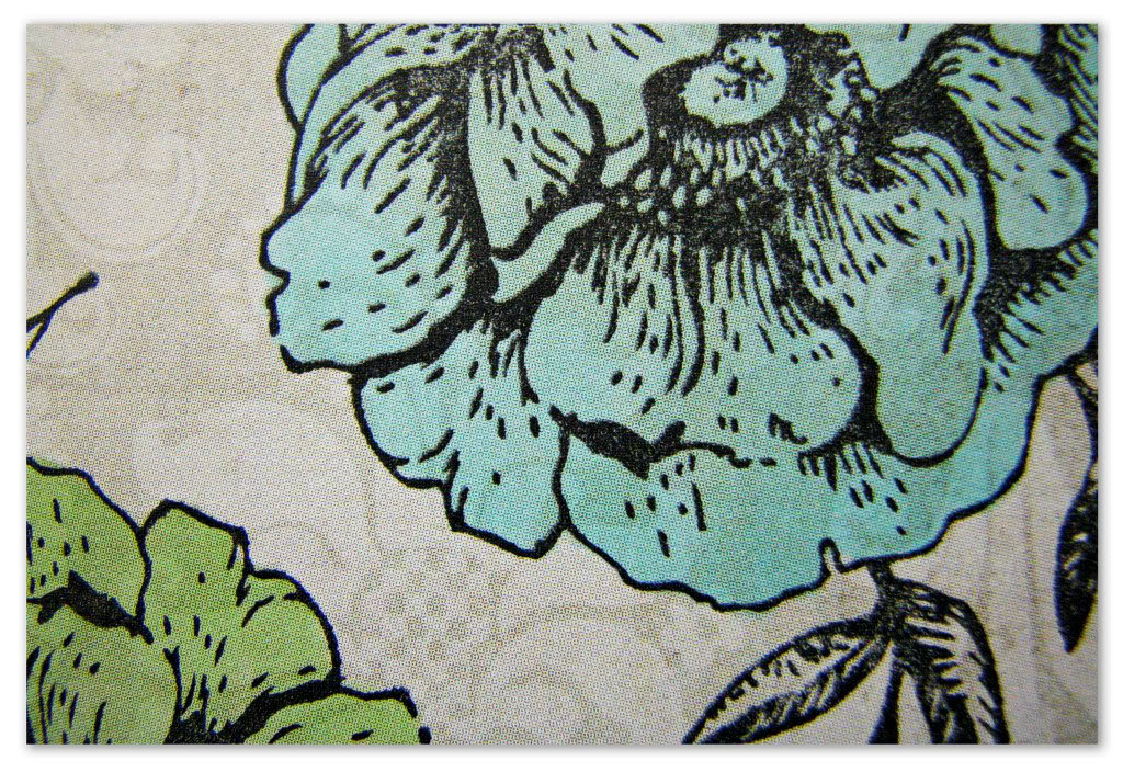
They ask to use our own blog header as an inspiration, and I thought it’s a prime idea. What I had in mind straight away, is stamping in bold black on a subtle patterned paper and then do simple colour blocking as it shows in the circle. It’s a dimensional, fabric-like effect that I was striving to achieve. Down to the little bits of background, showing through the coloured flowers…

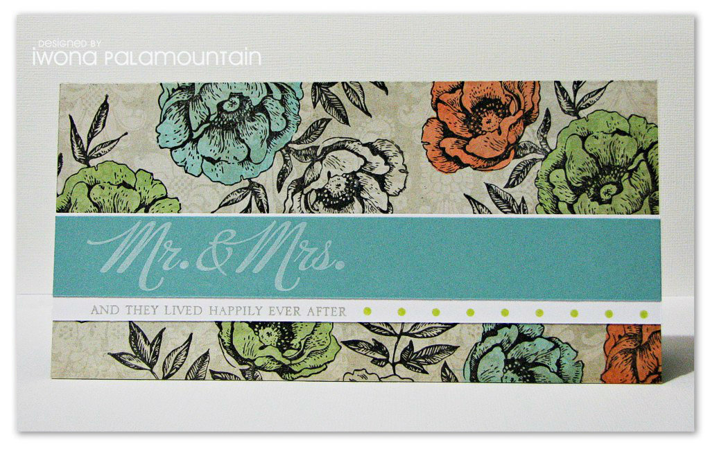
I wasn’t quite sure if it’s the way to go, but once I started putting the elements together, it looked pretty cool. I used Etched Flowers from Hero Arts for the background, and I stamped them over My Mind’s Eye Miss Caroline DP. Then I coloured some flowers in, with light shades of Copics.

I transferred the horizontal element - blog title, into sentiment strip. I stamped the phrase from PTI Big & Bold Wishes, in PTI Fresh Snow and Fresh Ink Provincial Gray. I also used the dots from PTI A Little Argyle, to mimic the lime coloured pattern in the logo.
I thought I’d decorate the inside as well:

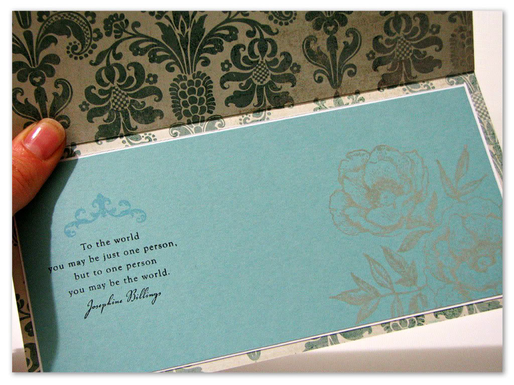
I used theactual patterned paper, for the card base, hence the inside is decorative as well. In an insert, I stamped the flowers again in grey ink, and the verse from PTI Out On A Limb Sentiments set. The flourish is from Mat Stack 1.

—————————————————

A few things to keep in mind if you decide to use my sketch:

- You’re kindly asked to save the image onto your computer first, and if you make a card based on it, please link back to this post.
- If you upload your card to an online gallery, use the code SSC79.
- Feel free to share the link to your creation via the Inlinkz widget, so that I can come and check it out!
- The colours/elements mean nothing towards the card. All styles, colours and supplies, as well as slight alterations of the sketch are welcome.
- A new sketch and sample is posted every Saturday, but you’re welcome to play any time! Just leave a link in the comments section after Inlinkz widget closes.
—————————————————


Sep 08

Waltzingmouse Sketch Challenge 114

Weekend is here!! With a rather annoying break in the routine that my spine forced upon me, I fell way behind with stuff, crafty or not. Since I’m feeling much better now, it would be time to build my way up the to-do list again, but it’s a bit lengthy and I’m not sure I’m happy with it :/
None the less, it feels good to make stuff again (without the pain) and I’m starting with a card made for this week’s Waltzingmouse sketch:

Isn’t that a cool one?? I based my design around Very Vintage Labels No. 10, which I cut with a corresponding Nestie.
Then I used Big Day Additions and the flourishes from the previous set, to fill it in with a message.

The rest of the stuff includes My Mind’s Eye paper (Miss Caroline) embossed with Flora M-Bossabilities for an extra texture, satin & fabric ribbon, Want 2 Scrap bling, Maya Road trinket pin, Kaisercraft ribbon flower, mulberry roses and Memory Box Chloe Stem die cut.
I distressed everything with Pumice Stone Distress Ink.

Colour inspiration, CR84FN62:

Hop over to the Waltzingmouse Sketch blog, to see more from the Mischief Makers! See you later,

Aug 06

August Beautiful World Tour

Hello Everyone and welcome to the first Flourishes Beautiful World Tour!!!
Those of you who have been following Flourishes for a while will know that the first Monday of the month used to be the Bring Back Beautiful Challenge. As we celebrate Flourishes’ 5th Birthday, there have been some changes and one of those is our team!
No longer are we a challenge team, instead we introduce FOUR new members - Sasha, Dina, Anne-Elise and Meredith, and each month we invite you to travel the world with us and be inspired by talented girls from all parts of the globe!!!
We are now represented by Australia, United States, Canada, Finland, England and Germany and each month one of the girls will be hosting the hop on the Flourishes blog, sharing a little about their creation and maybe even a little about their corner of the world!

So…..what does this mean for YOU?? Instead of being challenged to create and play along, all we ask is you do a little globetrotting and stamp our passports (leave us a comment) and you could WIN A FREE FLOURISHES STAMP SET!!!! Yes, you heard right, leave a comment and have the chance to win!! The catch is, you don’t know which country is going to be this week’s vacation spot (chosen blog) so leave a comment on each one by AUGUST 31st for your chance to win!!

If you’ve jetted in from England from Sasha’s blog then you have arrived at the right destination. If you haven’t, perhaps you’d like to start your journey back in Florida at the Flourishes Blog so you don’t miss any of the inspiration along the way!!

This month the hostess is Kathy, and our theme is to be inspired by a SONG!
The reasoning behind my inspiration is a bit twisted, if you will… :)
I had “Lady In Red” by Chris de Burgh in my head all day today - oh yes, I’m a bit of a sentimental chick and I adore this song. Even though the lady in the song is “pictured” in a red dress, I always thought it to be a perfect one for a wedding, with a strong focus on the woman - in the center of attention and feeling immensely loved.
We didn’t get a special dance at our wedding (hubby is not big on dancing), but I would totally choose this song if I had one… LOL
Anyway, this led me to pulling out the Wedded Bliss stamp set, and in turn creating this card…

I used the Whimsy M-Bossabilities™ folder for the main panel, which I partly matted with the flocked Kaisercraft paper (After Five) and embellished with some grosgrain ribbon.
The image/sentiment were stamped in Versafine Onyx Black, on a piece of white CS die cut with Flourishes Tailor-made Classic Keyhole dies, and I backed it with the gorgeous frame from Antique Frame And Accents (also from Spellbinders).
I finished the card by adding a Kaisercraft ribbon bloom & some leaves cut with Taylored Expressions Leafy Branch die, and decorating the sentiment with pearls.

And here’s my sketch inspiration… DS63:

I hope you’ve enjoyed visiting Australia - the next stop on your Beautiful World Tour is….

Thanks for visiting and happy traveling!! :)
Link

Apr 29

Sketchbook Saturday Challenge #57

Oh man… all I can say is, my apologies for the delay, delivering the sketch this week! I’ve been on a very low mojo for a couple of days… being a bit stressed about some assignments, and having deadlines chasing me - not a good combination.
Hopefully very soon I’ll be able to kick back and relax, and in the meantime I’m leaving you with this deliciously layered number… :)

My card evolved around the gorgeous stamp set from JustRite, called Shabby Chic Labels Four.
I discovered by accident their Friday Challenge #71 “Perfect Pastels”, I was taken by the colours they served and decided to play.

I wouldn’t be myself if I didn’t saturate the colours… just a tad 😉
However, I used the same shades of yellow/orange of Copics as given in the inspiration. I only didn’t have the exact pink so I replaced it with the closest match, and spiced it up with some shading.

I used the papers from three different collections by My Mind’s Eye. The stamp corresponds with S4-190 Labels Four Nestabilities®, and I also used S5-086 Bitty Blossoms for my flower and S5-096 Jar Labels for the tiny tag.

I’m always very happy to see your unique takes, so thank you for willing to share your cards with me! I can’t wait to see what you cook up this time :)

—————————————————

A few things to keep in mind if you decide to use my sketch:

- You’re kindly asked to save the image onto your computer first, and if you make a card based on it, please link back to this post.
- If you upload your card to an online gallery, use the code SSC57.
- Feel free to share the link to your creation via the Inlinkz widget, so that I can come and check it out!
- The colours/elements mean nothing towards the card. All styles, colours and supplies, as well as slight alterations of the sketch are welcome.
- A new sketch and sample is posted every Saturday, but you’re welcome to play any time! Just leave a link in the comments section after Inlinkz widget closes.
—————————————————
Photobucket

Mar 03

Waltzingmouse Sketch Challenge 87

Boy, has it been a busy week! Both in the ‘real’ life, as well as here on my bloggie, I somehow managed to do heaps… I’ve got all the satisfaction, but I feel so sleep deprived at the same time. Even now, I’m sitting here scheduling this post for launch tomorrow, and burning midnight oil like a pro. LOL
It’s 1.30am, and I’m seriously tempted to start on tomorrow’s stuff before it gets busy again… oi! I hear you scolding me now :)
Anyhow, if you can read this, it means that a new Waltzingmouse sketch is in da house, so let’s get cracking!

I channeled my inner Tosh this week (in a very humble way!), and came up with this (almost) monochromatic, and heavily distressed card. It’s a “look ma, no patterned paper!” card as well. I know, shocking.

Photobucket


Supplies: cardstock: PTI (Kraft, Fine Linen); stamps: Waltzingmouse Stamps (Text-It, Flourishes - Scallops and Dots, Big Day - Additions, Cameo To Go); ink: Distress Ink (Frayed Burlap, Pumice Stone), Brilliance (Pearlescent Orchid); Nestabilities Ovals/Shapeabilities Fancy Tags Three; Liquid Pearls (Platinum Pearl); lace; pearls: SEI

For the colour inspiration, I followed the new Kathy’s Lily Pad Palette challenge:

Hop over to the Waltzingmouse Sketch blog, for more eye candy from the Mischief Makers!
Be sweet,
Photobucket

Jan 25

January PTI Blog Hop

I’m happy not to miss this month’s PTI blog hop! It’s a fun one, too.
The challenge is to share a favourite project from 2011, along with a new one that was inspired by that creation.
Hmmm. To pick a favourite is an impossible task - not because I like them all, quite the contrary - upon looking back I always think something like “umm, it’s ok, but definitely doesn’t make my heart skip”. So I browsed through all my cards from last year and couldn’t quite decide on anything.
Finally I was able to compromise my fussy self, and picked this one (which is by no means a favourite, just a card that I like more than the others)…

Photobucket

I blogged it back in November, you can see the post HERE.
I chose this one because of the clean design, striking big flower stamp (of which type I’m a sucker for), and the play of colours.

I chose another simple design, although a bit different to the original. For the bold flower, I picked Year Of Flowers: Roses. This time I paper pieced them, instead of colouring - something that I loooove doing with this particular stamp.
I reduced background stamping to the strip of dots from Polka Dot Basics, and played with bold colour combination - this time yellows & olive.

Photobucket

Supplies: cardstock: PTI (Summer Sunrise, Lemon Tart, Harvest Gold), American Crafts (black), kraft, SU! (Old Olive); stamps: PTI (Year Of flowers: Roses, Polka Dot Basics); ink: Versafine (Onyx Black), Distress Ink (Frayed Burlap); border punch: EK Success

Thanks for checking it out!! :)
Photobucket

Related Posts Plugin for WordPress, Blogger...